Hello. How are you doing today? Oh, good.
This post is going to take you, step by step, through the entire process I use to get a manuscript ready to self-publish in paperback form. You don’t need to have any particular experience with design to follow this. I sure as heck don’t have any. But I can guarantee you, if you follow each step, you will have a ready-to-publish PDF. I feel comfortable guaranteeing that because this post goes into a frankly unnecessary level of detail on each step. Also this is a free article so there are really no stakes here.
Since this will be a fairly long post already, it’ll be a walkthrough and nothing more. There won’t be any writing tips or cost/benefit analyses regarding self-publishing. Instead, this post will assume that you have a finished manuscript that you have decided to self-publish as a paperback. As you can see, key phrases and terms will be put in bold to make this article easier to skim. Who actually reads the whole article on things like this, right? Not me. So if you’re in a hurry, just follow the bold font and I think you’ll still come out of this with a ready-to-publish PDF. One that I think will look pretty darn good!
It’s a lot, this article. Every single thing I could think of that seemed helpful. Apologies in advance. But I hope at least some of it is helpful to you on your self-publishing adventure!
To begin at the beginning:
Program and Platform
The way I format all of my books is through Microsoft Word, to be published through Amazon KDP. A quick aside about these choices: there are other programs you can use to set up the book, ones which might actually be better suited to the task. I go with Word because, while I’m far from an expert at it, I’m comfortable enough with it to make it work for me. If you like InDesign or Chimscrump, the latter of which I just made up because I couldn’t think of another alternative, I recommend using that instead. While all of the commands and menus I’ll be walking through are specific to Word, the general concepts will probably still apply.
There are also other self-publishing shingles available. Ones that are not a part of an evil empire. Unfortunately, I’ve found KDP to be the strongest platform for my purposes, factoring in ease of use, availability of the book itself, and quality of the printing. The only other platform I’ve gone ‘all the way’ with is Blurb (for the first novel I published, The Year of Uh, which is still a Blurb book), and I personally found it less intuitive to use, and resulted in a paperback that just doesn't feel quite as good to me. However, Blurb is definitely more fun to say than Amazon KDP. Plusses and minuses, to be sure.
Once more, for the skimmers: this guide will teach you how to use Microsoft Word to prepare a print-ready PDF for Amazon KDP.
Decisions, Decisions
I’ll level with you, designing a book is not the most electric part of the writing process. But that’s not to say there’s no creativity involved. On the contrary, I strongly encourage you to make motivated decisions about how you will format your paperback. It’s not just about making your book look good, it’s about making it read the way you want it to read.
All of my books are formatted slightly differently, to achieve a desired effect.
Some examples: Jairzinho’s Curbside Giants is a fast-paced story, so I made the font slightly larger than I otherwise would, and gave each chapter heading its own page. This means pages are getting turned more frequently than if I had used a standard twelve-point font, which I’m hoping subconsciously makes the reading experience just a teeny bit more kinetic. I had originally intended the book to be 5x8, as that feels like a better size for action-driven stories to me, but ultimately I changed it to 6x9 after determining that I wanted illustrations in it, just to give the images more space to occupy. Conversely, Down The High Tomb is a much denser, more introspective story, a motif of which is how soft and undramatic life-altering events can be when they arrive. So for that one, I went with smaller font in a 6x9 book and made the margins slightly larger, to increase the amount of negative space on the page. Something about couching the text like that gave the story a muted solemnity that I really liked.
This all might seem like overthinking, which it can be. You definitely don’t need to lose sleep over any of this. But I’ve found as a reader that these sorts of decisions can impact my experience with a book, so it’s worth giving at least a moment or two of thought to some of these design choices. In my opinion, at least!
The Great Copy/Paste
The first thing you’ll need to do is decide how big your book will be. I don’t mean page count, I mean the dimensions of the pages themselves. Generally speaking, I like 5x8 and 6x9 for novels, the former for more active stories, the latter for more cerebral ones. But Amazon offers a variety of sizes, all of which you can check out on their manuscript template page. Which I would recommend you visit now.
(If you scroll down below the "download” buttons on that page, Amazon includes a little how-to guide of their own. Definitely a lot shorter than mine, I’ll give them that. I personally didn't find their instructions helpful for getting my books to look the way I wanted, but if you want to know how to do something that I don’t cover, that’d be a good spot to look!)
As of this writing, Amazon has two download options for the templates: blank, or with sample content. When you pick one or the other, they’ll give you a .zip file with the templates for every size. I am sure there is a very good reason for this. At any rate, I strongly recommend downloading the blank templates. The ones with sample content can be useful as a reference, but there are a bunch of style and formatting choices baked into it that I don’t particularly care for. To be honest, I find Word’s style system so cumbersome that I just ignore it altogether. So I find it easier to start with the blank template, which is not without headaches of its own. But we will get through them!

For the purposes of the walkthrough, I’m going to use the 5x8 template.
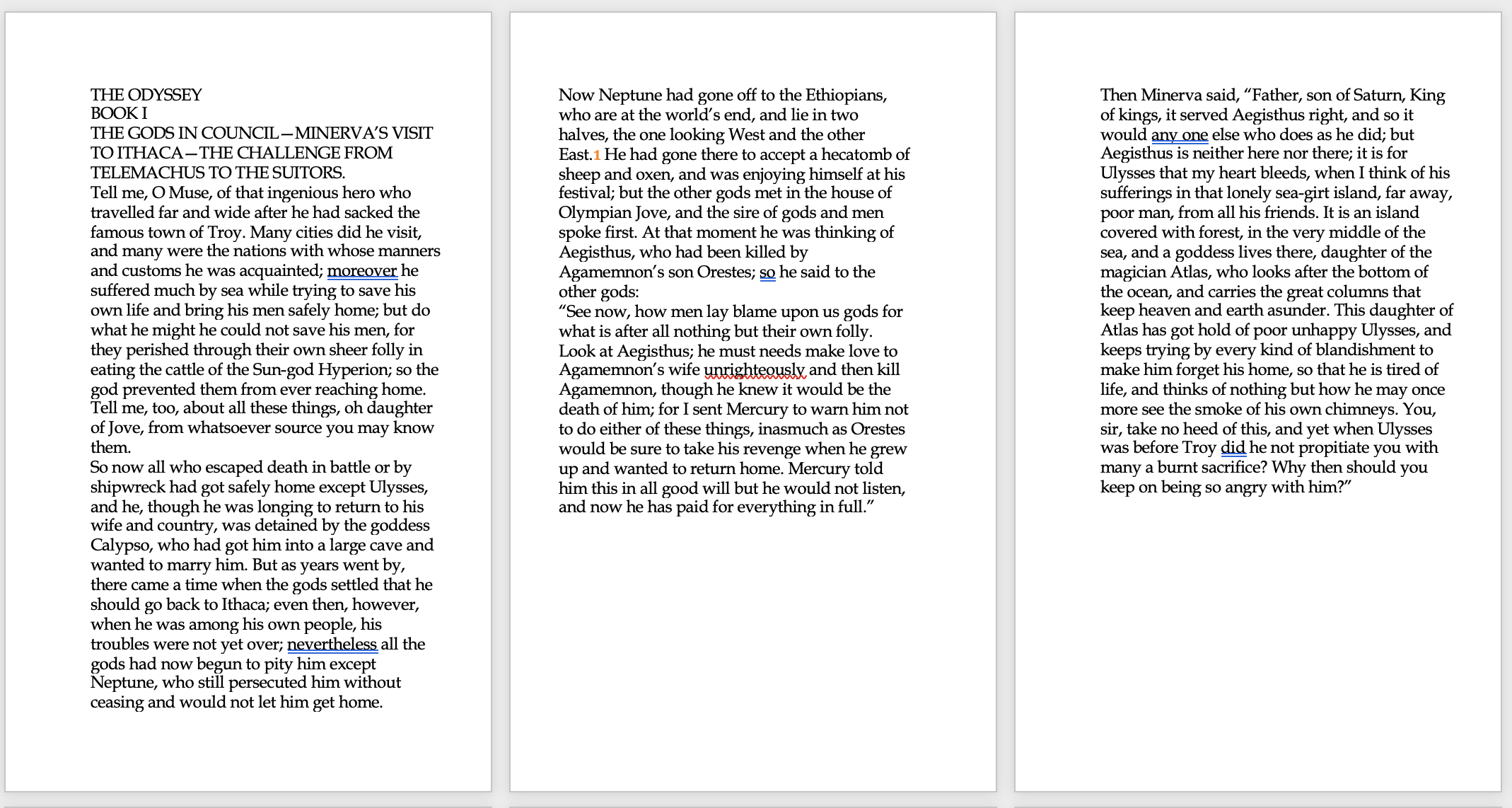
Regardless of what size you choose, though, you should now be looking at something like the page to the right there.
Now, you do precisely what the nice template tells you to do…copy your whole entire manuscript, and paste it into the template! As a sample for this article here, I’m going to use The Odyssey, which is in the public domain. I’m going to work from the plain HTML version posted on the Project Gutenberg website.
So. Copy and paste!
I always find this part somewhat exciting. The manuscript is finally becoming a real book!
At least, it’s on its way. Right now, it probably looks vaguely insane, with awkward justifications and big blanks after certain paragraphs. A bit like this:
The one weird thing there that we do like to see are the mirrored margins. The way the text is shunted off to the right or left on each alternating page is to leave room for the page to fold into the spine of the book.
Now, along the top of the Word window, look for the button with the pilcrow (¶) on it.
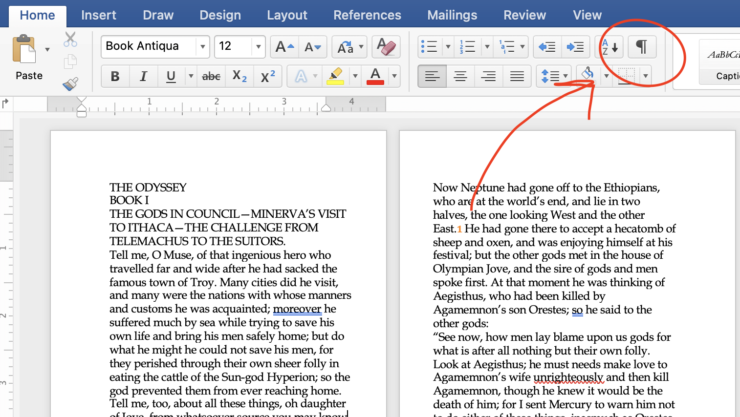
Clicking that button will either show or hide formatting details. I’m sure there’s a formal name for the button, but pilcrow is such a wonderful word, so anytime I’m referring to that ¶ button, I’m just going to keep calling it the pilcrow.
So hit the pilcrow and watch as your book becomes even more cluttered with black squares in front of each paragraph, and ghostly blue pilcrows at the end. Look closely and you will see little blue dots between each word. This is all useful information, believe it or not. Assuming your pasted text has the same issue mine always does. Which are the squares in front of each paragraph.
What, exactly, are those squares? Couldn’t tell ya. This is the first of many instances where I’ll remind you that I am not a Word expert. I just know that whenever those goddamned squares show up…big problems.
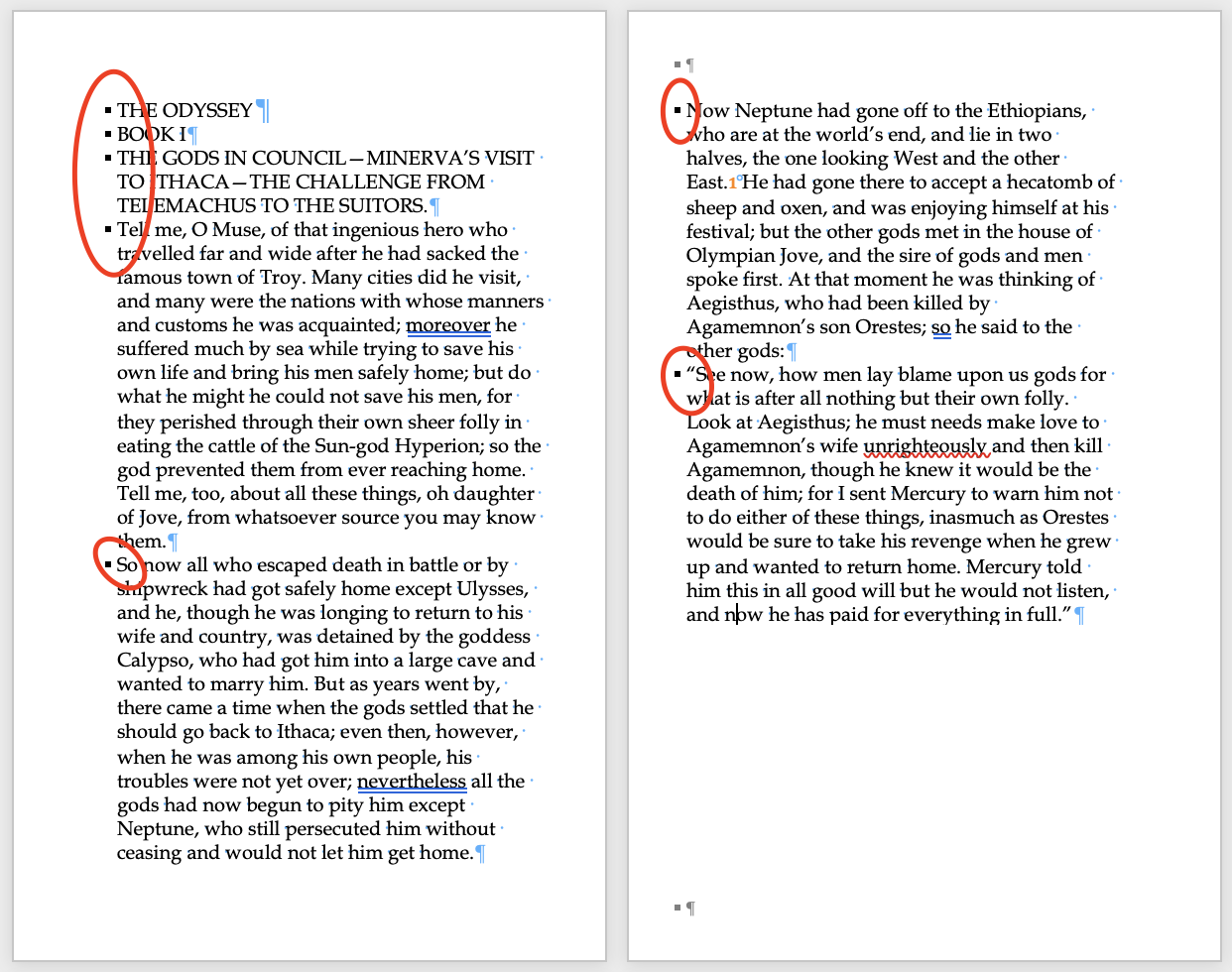
Specifically, the big problem at the moment is that massive blank space at the bottom of the second page there. Right now Word doesn’t want to let a paragraph appear on a page unless it can appear in its entirety. Which isn’t how books work, obviously. So we need to turn this feature off, and make the squares go away. Which is easy!
Select all of the document at once. Every single word of it. Command-A, baby! Then on the toolbar at the very top of the Word window, click Format, then select Paragraph from the drop-down menu. You’ll get a pop-up with a six tickable boxes. The problematic one at present is “Keep Lines Together”, but honestly, I recommend unchecking every single one of them, so the window looks like this:

This is a personal preference, though. Things like Widow/Orphan control (which will ensure you don’t have the last sentence of a paragraph left alone at the top of a page, or the first sentence of one creeping around the bottom) are not necessarily bad, I just personally prefer to handle them manually rather than trusting Word to do it. At the very least, make sure you uncheck “Keep lines together”. This will take those squares away and let the paragraphs spill out across as many pages as they need.
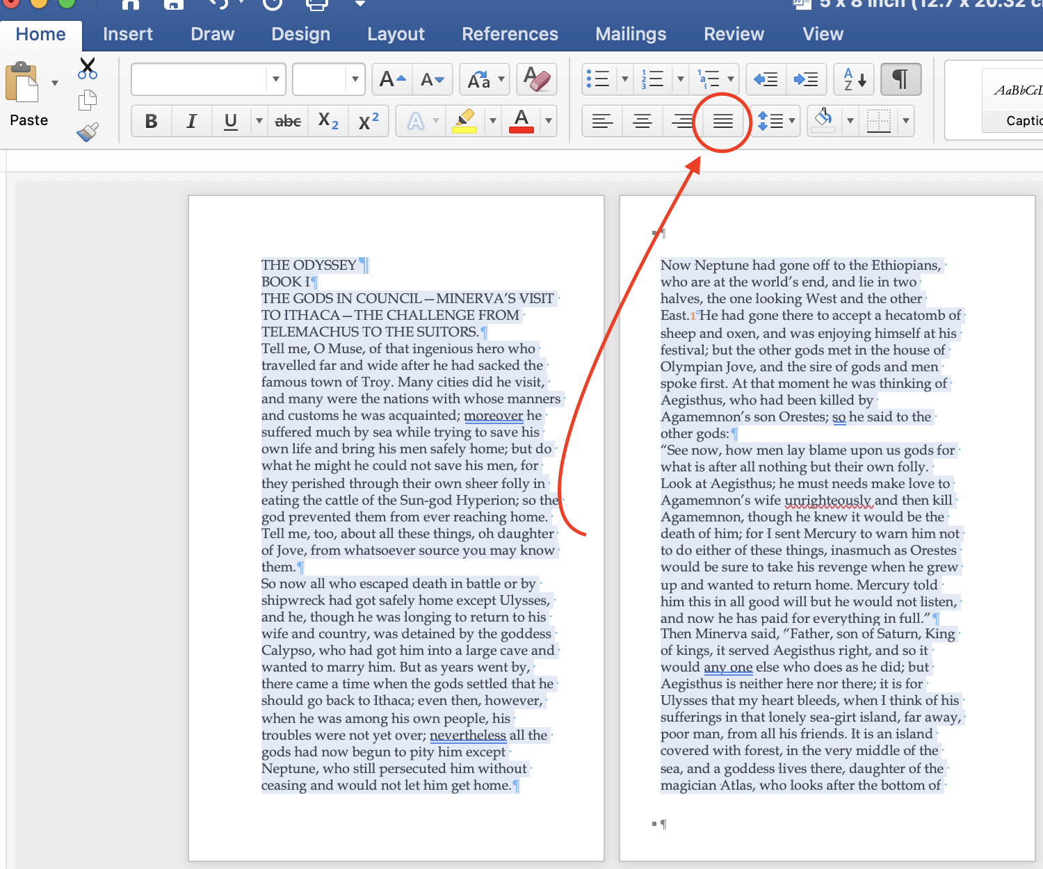
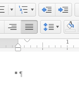
Now, just click the “justify” button, and your text will stretch to fill the page, just like in a real book. Which your manuscript is well on its way to becoming!
(The image below shows the text before pressing that justify button.)
The Bits Before The Story
The time has come for you to make a lot of choices that your reader will almost certainly take for granted. Let’s start from the very beginning here, with everything that comes before the story.
I personally favor a pretty minimalist approach to this. A blank page, then a copyright page featuring info on the editor/cover artist/whoever else, as well as my social media handles, then the title page.
The copyright information I’ll do in the same font as I use on the story text, just smaller (typically size 10). I’ll keep that left-justified. The title itself, well, get creative! Pick a font you like, use a clean version of any title treatment you get from your artist, or go online and find a new font to play with, then size and arrange it however you like. If you plan on selling these at book fairs and the like, I recommend leaving room to sign the book.
(Before you use any font you find online, though, make sure it’s either free for commercial use, or that you pay for a license.)
So, for example, here is how the first four pages look (including all the blue pilcrows, which will be invisible when we hit that trusty pilcrow button again to hide the formatting), now that I’ve formatted the first three:

Beautiful. Perfect choices. No notes.
The way these will appear in the paperback is as follows: the very front of the first page will be blank, then turning that will reveal the copyright info on the left page and the title on the right.
As for the specific verbiage of the copyright page, this is what I use. You’re free to use it and tweak it or do whatever you see fit with it.
Copyright © [Release Year] by [You]
Cover artwork by [Your Artist]
[Your Artist’s Website]
All rights reserved. This book or any portion thereof may not be reproduced or used in any manner whatsoever without the express written permission of the publisher except for the use of brief quotations in a book review.
Designed by [You]
Edited by [Your Editor]
www.[yourwebsite].com
Facebook/Twitter/Instagram: @[Your Social Handle]
You can also include an introduction, preamble, acknowledgements, whatever you like before the story itself here. It’ll be up to you how to format those pages; I recommend looking at books you’ve found aesthetically pleasing, and trying to mimic how they structured everything. Sizing, font choices, things like that. Just keep in mind where in the physical book these pages will appear. If it’s an odd-numbered page, then it will be on the right side of the paperback. Even-numbered pages will be on the left side. There’s no wrong way to do anything here, but for example, I personally don’t like when chapters begin on the left side of a book. No clue why. It’s just displeasing to me.
Maybe you are not afflicted by any powerful, arbitrary aesthetic opinions like that. Or maybe you are! Either way, page placement is something worth keeping in mind, especially going forward, as we get to…
The Bits That Are The Story
A lot of what follows are going to be my personal style choices. I’m essentially going to show you how to build a book that looks like mine tend to, albeit with a level of detail that hopefully leaves room for you to see how you can deviate from my decisions, if you so choose, to follow your own vision. Font choices, sizes, left/center/right justifications, all of these will be down to your personal preference. Or you can do exactly what I do, whatever works!
First, I make a few preliminary changes to the entire manuscript. First up - and you’ll see this change on all of the images going forward - I changed the font of the story to “Garamond”, size 12. Garamond was my go-to font for a few years. The past few manuscripts (none of which have been published, as of this writing) I’ve switched to Baskerville, just for the hell of it.
Next up, I’ll change the line spacing to 1.15, which I find the most aesthetically pleasing. My first few novels I did with single spacing, and in hindsight that just looks a bit too crowded on the page for my tastes. I think I might also have done one with “1.25”, but I can’t remember for certain.
Line spacing control can be found here:

(Numbers other than those in the drop-down - for example, 1.25 - can be entered via the “Line Spacing Options”)
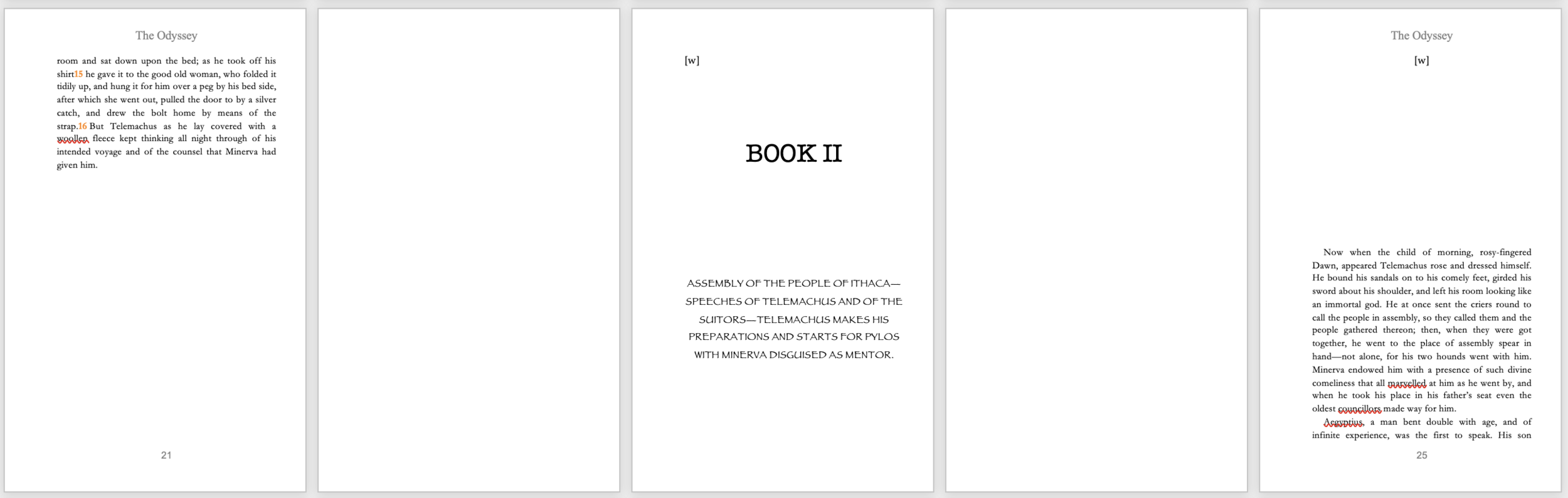
Now, for something like The Odyssey, I want a more expansive, epic feel. So I’m going to give each chapter - or ‘book’, as they’re called in the manuscript - it’s own page, along with its respective subheading. And by golly, I’m going to continue my tour through Microsoft Word’s most dreadful fonts in the process.

That “Book I” page is definitely not something I’d allow into a real book, but what it looks like is irrelevant to all of this. So I’m not gonna waste time making it look pretty. Sorry!
Actually, you know what, I’m not sorry.
On topic: notice the blank page I keep between the “Book I” page and the text of Book I itself. This way the “Book I” page is odd-numbered, and so will appear on the right side of the book. Then, turning the page, the reader will see a blank even-numbered page on the flip-side of the “Book I” page, and then the text of the story itself will appear on the right side.
I feel like that’s really confusing to describe. But it’s simple. I like stuff to start on the right side of the book. So I formatted the book to have everything be on the right side. Just how I like it! But you should put this together however you like it, of course! Of course!
A quick personal quirk to flag - if you look carefully there, you can see that I’ve put “[w]” in the top line of the “Book I” page, as well as the page with the story text on it. I do this to any page that begins a section - be it a chapter heading page like the “BOOK I” example, or the start of a chapter itself - where text is not filling the entire page, but instead beginning at a certain distance down from the top. I strongly recommend you do too.
The reason is that, even if you don’t do any editing of the text after its in paperback form (and for whatever it’s worth, I usually do the final three or four drafts directly to a proof of the paperback), text can get shifted as you’re formatting. By plonking a [w] at the top of the page once you’ve gotten things positioned where you want them, no matter how much the text shifts as you’re formatting, all you have to do is go back to each section heading and ensure the [w] is still in the very top line of the page. If it is, you’re golden. If it isn’t, just add or remove paragraph breaks (from above, naturally, so as not to disturb your perfect formatting) until it is again. Now you’re golden!
Why a [w], then? I can’t remember. It really doesn’t matter what it is. It should just be some sequence of characters that you know, for a fact, will not appear anywhere in the text. This way, when you’re ready to publish, you can just go to Edit > Find > Replace, then instruct the document to Find “[w]” (or whatever sequence of characters you input), and Replace it with “ “ - which is to say, a space. Thereby clearing your formatting anchors in an instant. And don’t worry, I’ll walk you through that in more detail at the end of this.
Again, you don’t have to do any of what I just outlined above. But I strongly recommend you do. I can’t tell you how many times those little [w]’s have saved me having to effectively re-orient the entire document.
Moving on!
The next thing to do is set the first-line indentations of each paragraph. To do that, you’re going to use these little slidey-boys running along the top of the page.

Highlight all of the text you want to have a first-line indentation (which means not highlighting the heading or subheading for the next section, in my case the words “Book II” which appear further into the manuscript, because I want those to be centered without the indentation), then move the top triangle to where you want the indentation to be. I personally favor a shallower indent - it just looks cleaner and more professional to me - so I’ll move that top triangle over two notches. Check out what that looks like to the right, and the results of that two-notch shift below.
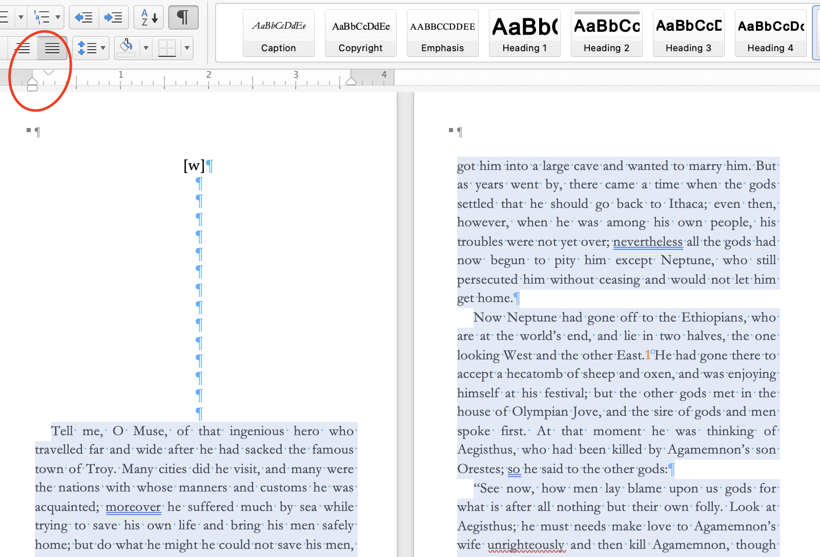
Now you can see, the first line of each paragraph is indented. Readability!
Oh, and a quick potential troubleshooting note, if, while writing your manuscript, you hit “tab” to manually indent each paragraph…you’ll have to go through and manually delete those “tab” hits, one by one. There’s no way I’m aware of to Find/Replace a tab hit. Sorry. I’ve been there. No fun.
The final touch to add to the story text is something that I personally recommend you save until you are on one of your very last drafts, once you feel confident that your next (and possibly last) read-through will demand very few minor changes to the text. That’s because this next step is annoying as hell to undo.
That next step is adding hyphens to split longer words over two lines.
An Entire-Ass Section Devoted To Hyphens
Now, mechanically, this is simple. All you do is look for lines where the words are fairly far apart, and see if you can add a hyphen to the first word of the following line, thus moving the first section of the now-hyphenated word up to the fairly-far-apart line. I would recommend hitting the pilcrow again for this, to hide the formatting marks, as those dots between each word can make it harder to accurately apprehend which lines are awkwardly spaced and which aren’t.
Conveniently, the very first line of the text in my sample Odyssey paperback (“Tell me, O Muse…”) fits the bill of a line that can stand to be hyphenated.
But…take a beat before you put that hyphen in! This is a pretty obvious note that I wish I’d been given when I did my first few books, but hyphenate for readability, not aesthetics. I would strongly recommend you hyphenate only in between syllables, when possible leaving enough of the word on the first line that the reader’s brain can fill in the rest of the word by the time it gets to the rest of the word. The first book I designed myself, Westmore and More!, is riddled with hyphenations I made entirely to get the words to fit tightly in each line, without paying much attention to how that disrupted the flow of the text itself. I find that if you can say the word out loud, pausing slightly wherever the hyphen falls, and the word isn’t completely mangled, then you’re probably good.
Feel free to skip to the next section if you feel like you get the gist already, but because I wish I could beam something like this back to my younger self, here are three examples of hyphenation, each of varying qualities:

In that image there, I would feel good about the hyphenation of “travelled” from the first line to the second. Never ideal to hyphenate the first line of a chapter, in my opinion, but sometimes the line just looks so bizarre without recruiting part of a word from the second line, you don’t have much of a choice. Granted, you could always do a bit of stylization to the first few words of the chapter, or do a drop cap, something like that, to change up the spacing. If all you can do is hyphenate, though, splitting it up as “travel - led” ain’t bad. I think it looks best to put the hyphen between a double letter if you have them, rather than leaving both of the same letter to one line or another.
“Acqu - ainted” is a borderline case. Ideally I’d love to split it as “acquain - ted”, but there isn’t enough room for more than the “acqu” on the fourth line there. It’s a bit of an awkward split, phonetically, and the “acqu” could be the beginning of a fair number of different words that the reader could fill in on their way to “ainted”, which isn’t ideal. Sometimes I’ll go with a hyphenation like that, sometimes I won’t. It’s a judgment call based on how the paragraph looks without any hyphenation at all (i.e. are the white patches between the words distractingly large?), how far into the story we are (I’m more comfortable with borderline hyphenations later into the story, when they reader is hopefully in the flow of the story enough to not notice a suspect formatting choice), things like that.
The hyphenation at the end of that first paragraph, cutting the word “source” into “so - urce”, is an example of something I would never do…now. It’s the sort of stupid stuff I did when I was starting out though. It makes such a marginal difference in the formatting, it’s not worth chopping “source” in two, right in the middle of two vowels that really ought to stick together.
Those are my hyphenation suggestions! Is this the level of detail you were looking for in a formatting guide? Gosh, I really hope so!
Anyway, we’re in the home stretch here. Just take everything in the above sections, and apply it to…your entire manuscript. Play around with different choices until you have everything looking the way you want it to, and we can get to…
Section Breaks / Headers and Footers
Microsoft Word’s “section” features, as I understand it, can get relatively complex. As with my approach to most of this formatting process, though, I’ve always favored engaging with the design tools on offer in the simplest manner possible, even if that potentially means I have to do a bit more “manual” work as a result.
So, what are section breaks, and why are they useful? Basically, they block off one portion of the book from another, allowing you to make different formatting decisions in each section. If you wanted, you could use these to get into some wild House of Leaves-style shenanigans. But I primarily use them to put headers and footers on pages with story text on them, and keep those headers and footers off of blank pages, or chapter-title pages when I’m using those.
The first thing you’re going to want to do, if you haven’t already, is hit the pilcrow once again to show the ghostly blue formatting. Next, I’ll find the best spot to put down my first section break. I don’t want the headers or footers to start until the story itself does, so I’m going to put my first section break somewhere at the bottom of the page immediately before the first page of story text.
You do that by clicking on the line of the page where you want the section break to go, then selecting Insert > Break > Section Break (Continuous).

Click that, and you’ll see a section break appear wherever your cursor was (don’t worry, this will be invisible when you use the pilcrow to hide the formatting).

(Depending on where the text is justified on the page, the section break might not stretch across the whole page like that. It doesn’t have to - don’t worry if it doesn’t look exactly like that!)
We’ve now made everything prior to that section break - the credits page, the title page, the “BOOK I” page and the blank page on which the section break has been placed - into Section 1. Everything after that, beginning with the first page of story text, is now Section 2.
We’re going to add more sections than just two, but I would recommend you put in the headers and footers you want now. If you make a ton of different sections right up front, you’ll have to go through and manually add the header and footer to each section where you want it. By putting in the header and footer you want up front like this, the header and footer will be applied to the entire book, and then all you have to do is remove the header and footer from sections you don’t want it to be in. Which I find a lot easier.
The first step in putting in your headers and footers is double-clicking anywhere at the top or bottom of any of your pages, where the headers and footers will go. This will allow you to edit the headers and footers. I’m sorry for how many times I’m going to say ‘headers and footers’ in this section but there’s no other way.
Actually, no, you know what? From here on ‘headers and footers’ are ‘H&F’. That’s a choice I can make.
So. Click anywhere the H&F would be to enable editing of the H&F. Your screen should now look something like this:

Thanks to those blue tabs, you can see where Section 1 ends, and Section 2 begins. But hey, what’s going on with that “Same as Previous” in section 2?
I’m so glad you asked.
Along that top ribbon menu thing, once you entered H&F editing mode, you should have automatically been bumped to the “Header and Footer” tab. There are two critical changes to make here. The first, is make sure that “Link To Previous” is not activated. It probably will be by default - you do not want that. Or maybe you do, I don’t know your choices. What it will do, though, is link each section to whatever came before it. As in, changes to Section 1 now change Section 2, and vice versa. I do not understand the point of this feature. So unless you want to defeat the purpose of having made separate sections, I strongly recommend you just turn this feature off.
The other thing you’re going to want to do is move the footers up a touch. I’ve found that, despite this being an Amazon-supplied publication template, their footer placement (.35” from the bottom, by default) often gets flagged as not meeting the publication guidelines. It has for me, anyway. So I’ve found that changing that footer distance from .35” to .55” solves that issue.

(I kept the number at the default .35” in the screenshot there, but remember, you want .55”!)
The way you make these changes is by placing your cursor in the header or footer (H or F?) you want the change applied to, and then, uh, making the change. Important note: you have to make the change in each H&F in each section. There are four total - the header on the even page, the footer on the even page, the header on the odd page, and the footer on the odd page. Make sure you get them all!
Now…design your H&F! My personal preference generally puts the title of the book on the odd pages, and my name on the even pages (you should probably do your name though), then the page number on the bottom. Everything center justified. That’s just how I like to do it, but obviously there are loads of ways to structure these!
Quick note on page numbers: the way you insert them is from that H&F tab on the ribbon up top. Select Page Number > Page Number.

From there, you’ll get a pretty straightforward pop-up asking where you want the page numbers to appear on the page.
Now…here’s a really dumb thing my Word does. Will yours do it? I hope not. It’s super annoying. But in the event it does…here’s how to undo it.
What happens to me is this:

The page number shows up with a line above it. Now, that might be a look you want. In which case, great! But it’s not a look I enjoy. Feels too formal for a novel to me. And more to the point, it knocks the number down far enough to risk being outside of what KDP considers acceptable for publication.
That line, as it turns out, isn’t just a bit of text you can delete. It’s a dang old border. So! To get rid of it, if you so desire, highlight the number in the footer, then go to Format > Borders and Shading.
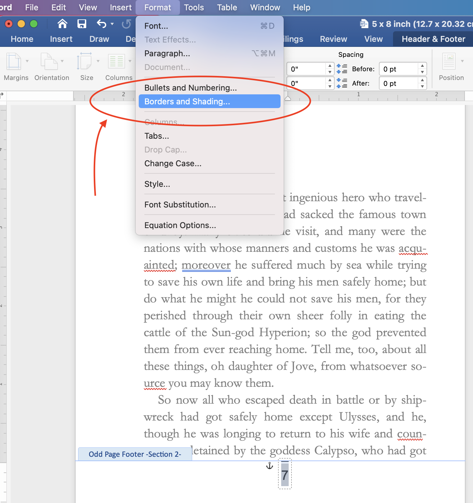
From there, you’ll get a pop-up window that looks like the one below. Note the right side of the window, there’s a little square telling you where the border on the selected text is. In this case, as I’ve circled, there’s a line running along the top. To get rid of it, click what I’ve circled on the left side of the window, the box that says “None’.

Now your numbers should be free of their fiendish upper borders! If it didn’t work, make sure you’ve highlighted the number properly, then try again.
Assuming you’ve gotten your H&F to look the way you want them, it’s time to set some more section breaks, to block off section 2 (in this case, the text of Book I) so that we can remove the H&F in the next section. You’ll do this the same way we set the first one, by selecting a space near the bottom of the last page of each section, then going to Insert > Break > Section Break (Continuous).
Since I don’t want H&F on the “BOOK II” page, but I do want H&F on the pages showing the actual text of Book II, I’ve added a break at the end of the Book I text (to create the end of Section 2 and the beginning of Section 3), then one at the end of the “BOOK II” break section (to create the end of Section 3 and the beginning of Section 4).
(You’ll also notice the blank pages I left in between. This is just to preserve my personal little quirk of not wanting sections to begin on even-numbered, i.e. left-side pages. I’ve also plopped in my little [w] formatting marks at the top of each page with text beginning partway down the page.)

If you click in one of the H&F spaces to bring up the H&F editing window, assuming you did something similar to what I did here, you should see you have Sections 2, 3, and 4 in front of you. Or you might only have a section 3, if you didn’t do a separate splash page for a chapter title. However you did it, there should be multiple sections!
Let’s say you were doing something like what I am here. That want to have those middle three pages in that image be without H&F. To do that, first make sure you’ve unselected that “Link To Previous” option in all of the H&F. That’s the even-page H&F in Section 3, the odd-page H&F in Section 3, the even-page H&F in Section 4, and the odd-page H&F in section 4.
Once you’ve done that, just delete the H&F from the middle section…and it should look like this! (I’ve hit the pilcrow again, just to really show you how clean it looks. But I also left my [w] formatting marks because I’m lazy.)
And…that’s about it! All you’re going to do is repeat the above steps for the entirety of the book, until you’ve got the whole thing looking the way you want. If you’re into that “About The Author” life, you can add that to the end, and I’d also suggest an “Also By” page if you’ve got other books out. But otherwise…yeah! I think that should be everything you need to finish formatting!
Good luck!
Exporting to PDF
Once you’ve gotten the whole book the way you want it, with all your H&F and chapter headings and hyphenations and whatever else looking juuuust right, it’s time to export to PDF.
First thing, though, is if you used formatting marks like the [w], you need to remove those. Do that by going to Edit > Find > Replace.

You’ll get a little window on the side of the screen then. Simply input whatever your formatting mark was (in my case, [w]) into the “Find” window, then in the “Replace” window, just hit the space bar.
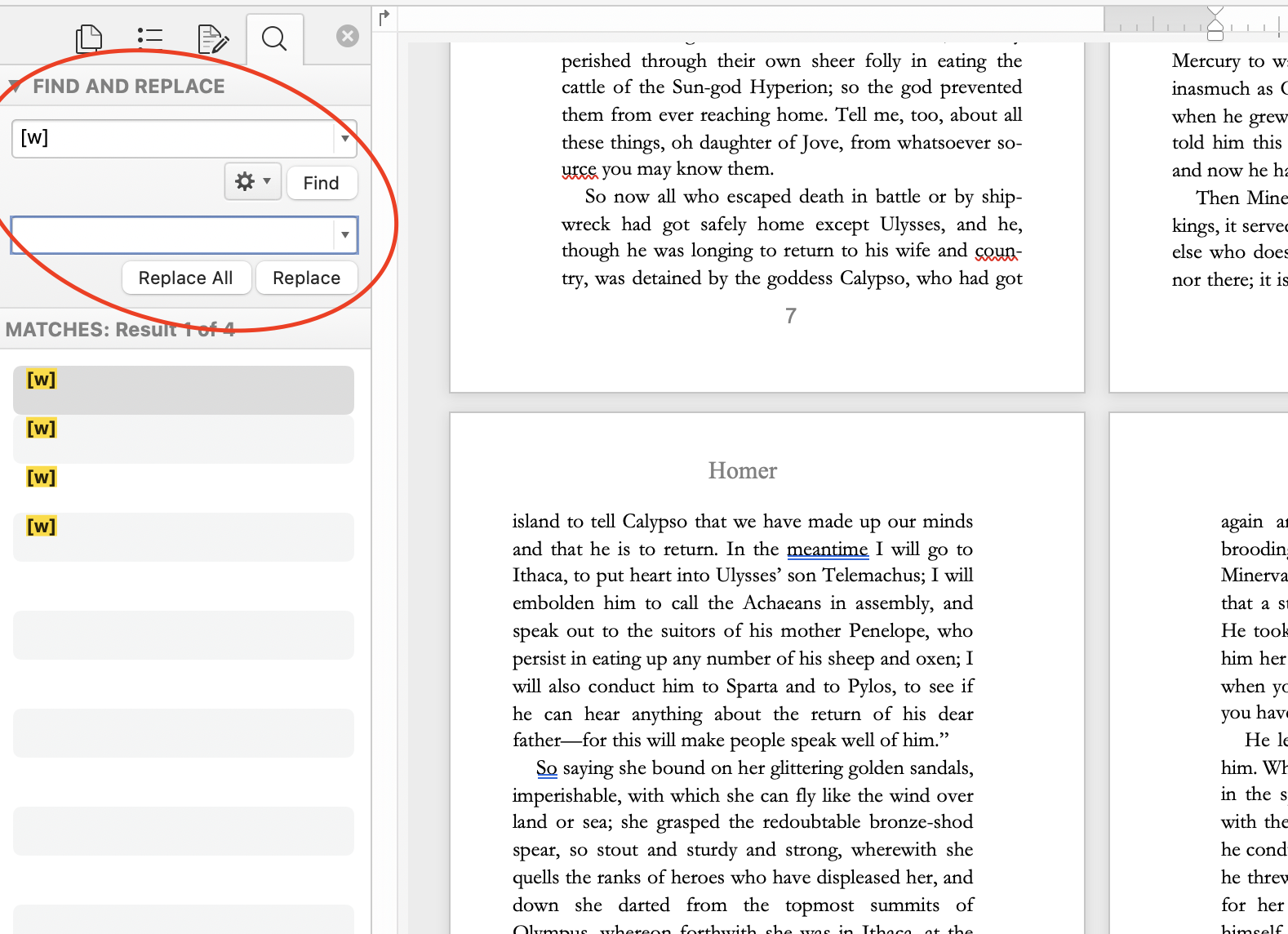
That will erase all of the [w] markings, and leave you with a clean, ready-to-export PDF.
To make that happen, you’ll go to File > Print.

That’ll give you a pop-up window. Just hit the PDF drop-down in the bottom left, and select “Save As PDF”.

That’ll get you a pop-up window like you’d get when saving any other file. So select where you want to save the PDF, and save it.
(One last troubleshooting thing before the end - if the document prints out strangely, i.e. if it prints as 8.5x11” pages rather than your chosen size, go to File > Page Setup…

…then on the resulting window, hit the Paper Sizes bubble, and from the drop-drown, select “Manage Custom Sizes”…

Then in the resulting pop-up window, copy these presets, changed the page size from 5 x 8 to 6 x 9, or whatever your page size is.

I’m pretty sure you won’t have to do any of this, since your page size should already have been set up by loading the Amazon KDP template…but I also remember having some issue with getting the PDF to print correctly when I started this a number of years ago. I’m pretty sure this was the solution to the problem. But if you’re having any issues in the export process, say so in the comments [which I will do my best to keep on top of], and we can figure it out!)
Otherwise…
Congratulations, Author!
Assuming all went well, you now have a print-ready PDF saved to your computer! Great work, buddy! You did it! If all did not go well, then fuck. That sucks. Sorry you do not have a print-ready PDF saved to your computer.
I hope you do have a print-ready PDF saved to your computer though! Because that’s the first step on an exciting and terrifying little journey. Self-publishing is a tough road, but the creative autonomy it gives you makes it a profoundly rewarding one. And if this is your first book, seriously, congratulations!
If you’ve got an issue that isn’t addressed here, let me know in the comments. But also, if this was helpful, let me know that too! And as obnoxious as I find this self-promotion bit, I would also encourage you to sign up for my mailing list, or follow me on my various socials media. I’m planning to put out more articles like this - definitely one for building an eBook, maybe a more detailed style guide for Word paperbacks - and those sources are the best place to hear about said articles when they drop!
Check out the socials below, mailing list to the right.